In part 5 of this tutorial series we created the Enemy script to move the enemies, we also created the EnemySpawn script to spawn the enemies.
These two scripts in combination with the Collector script form the gameplay mechanism of our game.
In this part we are going to talk about Unity’s UI system and create the main menu for our game where we can select the player with which we will play the game.
Introduction To Unity's UI System
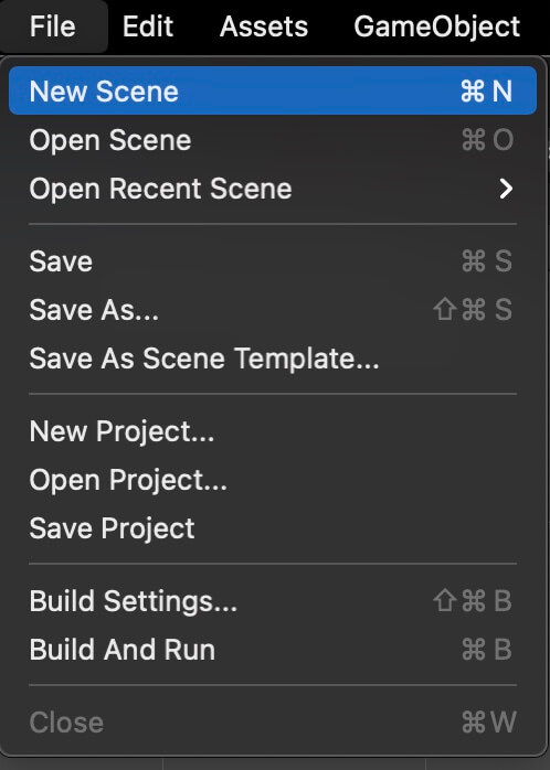
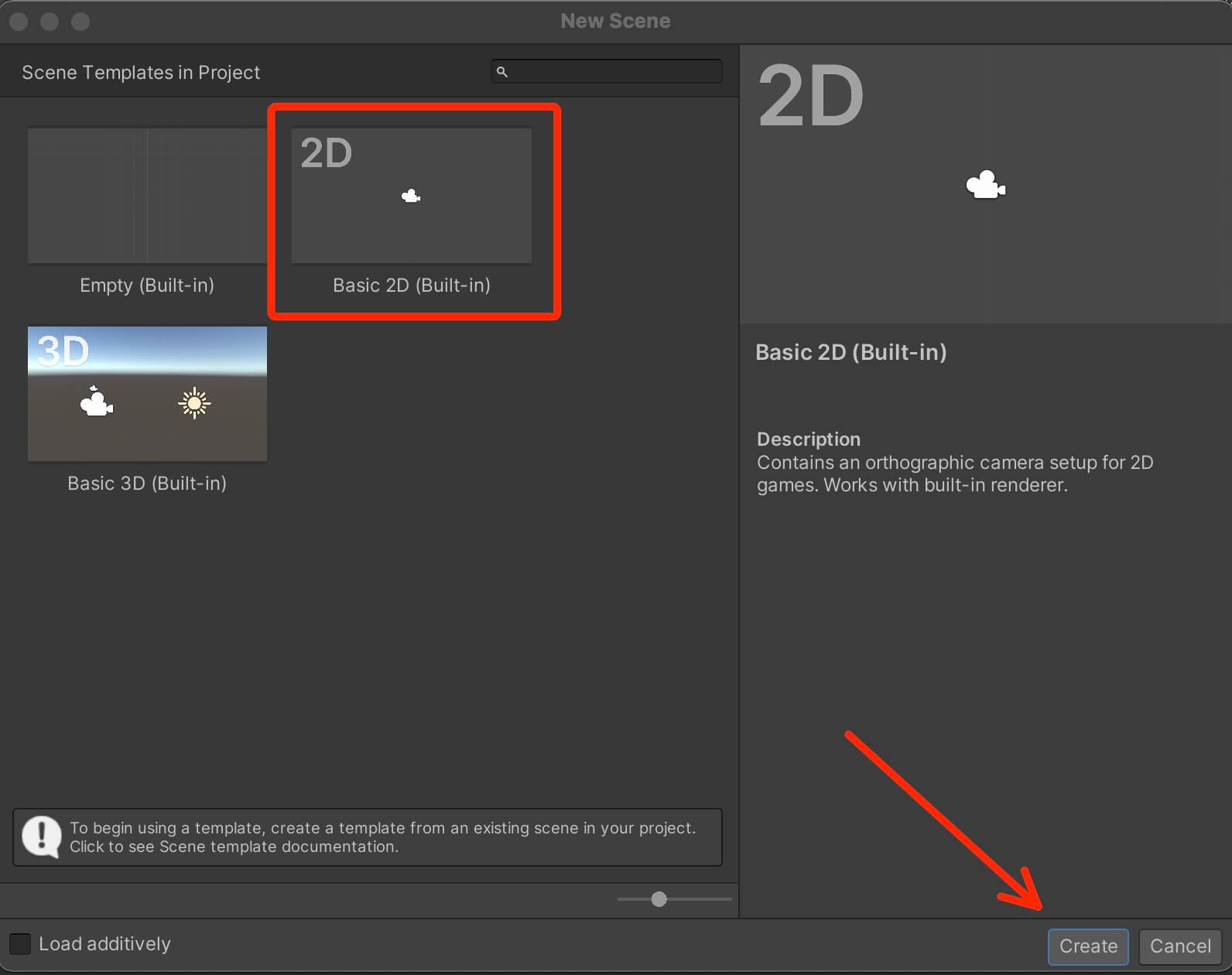
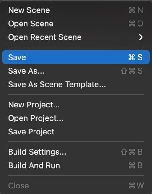
Creating a scene like this will not save it automatically, so you need to save it manually by holding CTRL + S or CMD + S on MacOS, or File -> Save or Save As:
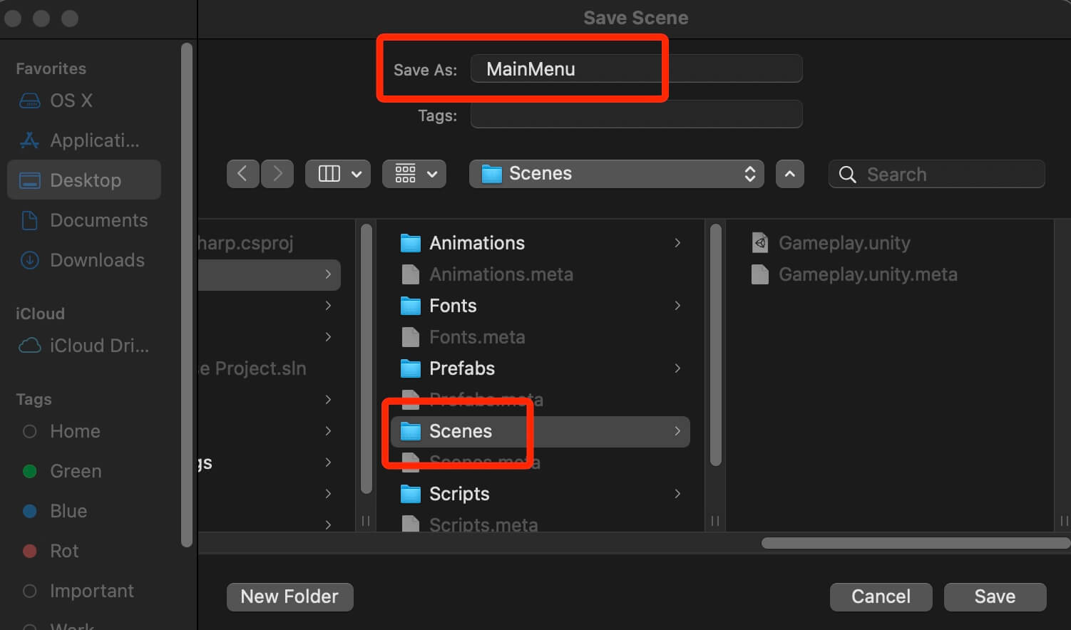
When you are prompted to save the scene make sure that you set the correct save destination, and in the Save As field give the scene a name, in our case MainMenu:
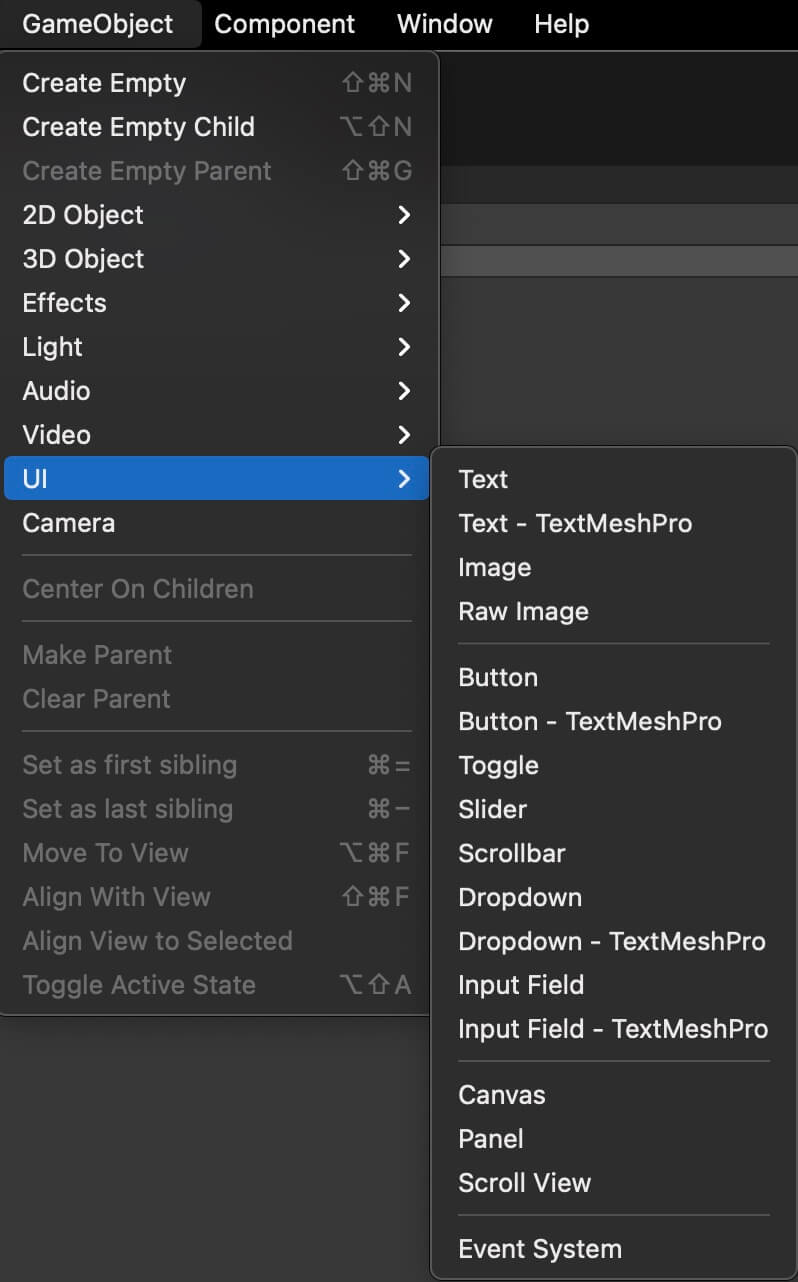
Now, to create a UI element you can either click on GameObject -> UI:
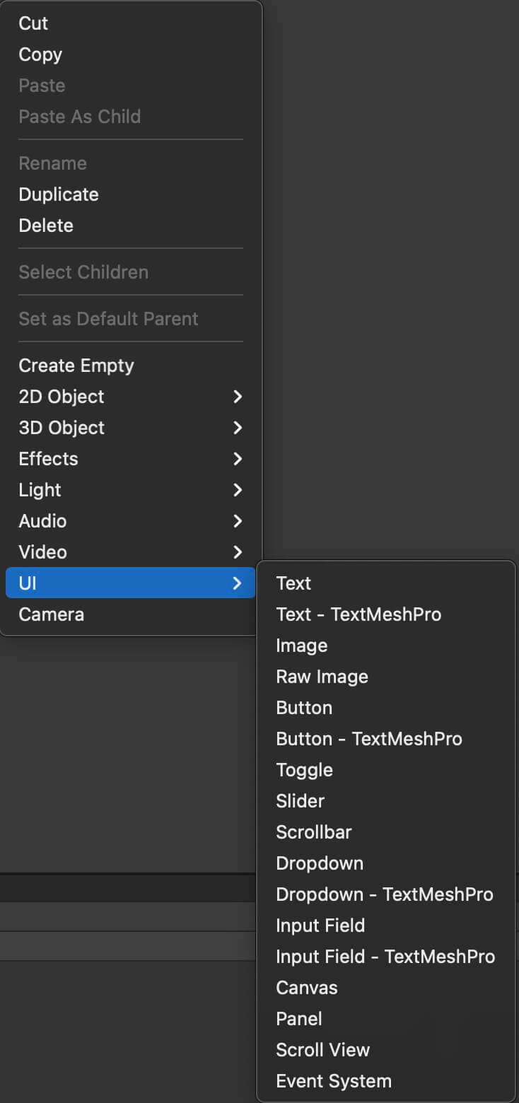
Or, inside the Hierarchy tab, Right Click -> UI:
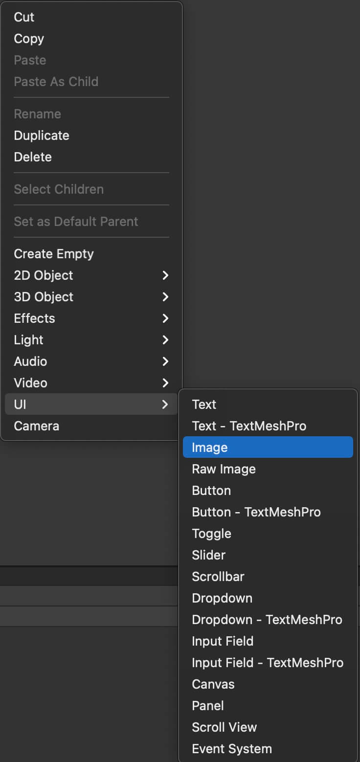
Let’s start by creating a simple UI Image. In the Hierarchy tab, Right Click -> UI -> Image:
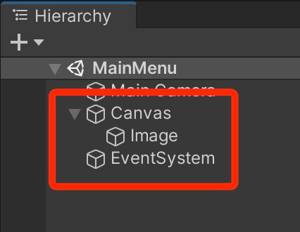
You will notice that not only the Image object has been created, but also a Canvas and EventSystem object:
UI Canvas
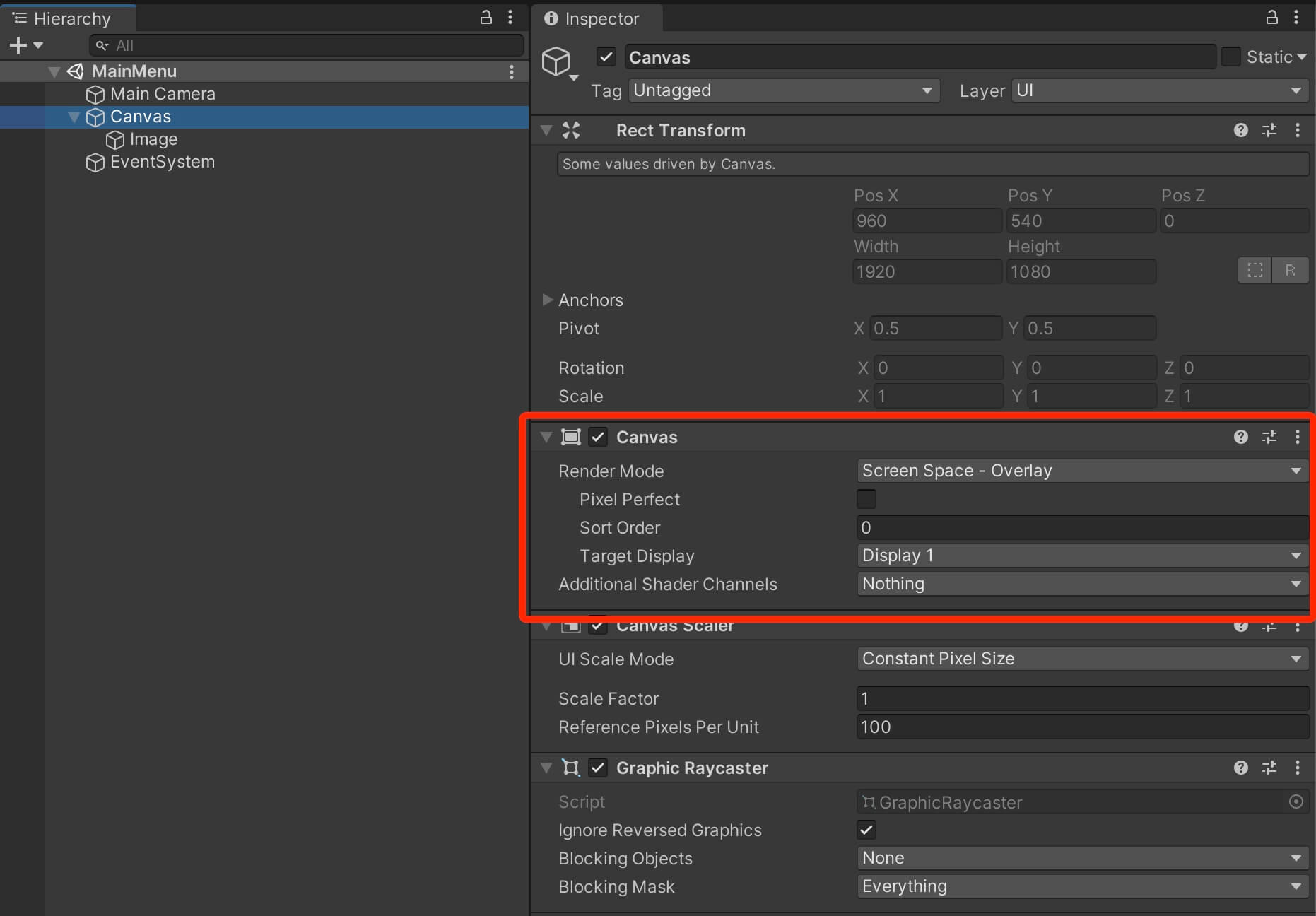
So what is Screen Space – Overlay render mode?
The Screen Space – Overlay render mode will place the UI elements on the screen rendered on top of the scene. If the screen is resized or changes resolution, the Canvas will automatically change size to match this:
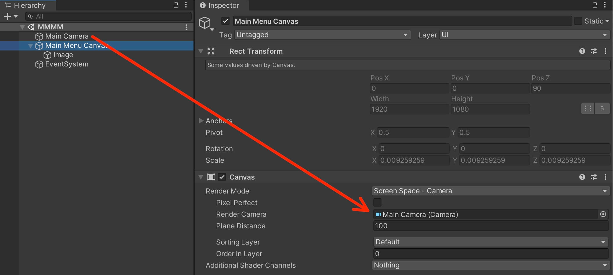
Screen Space – Camera render mode is similar to Screen Space – Overlay, but in this render mode the Canvas is placed a given distance in front of a specified camera object(we drag the camera object in the empty field).
The UI elements are rendered by this camera, which means that the camera settings affect the appearance of the UI.
If the screen is resized or changes the resolution, the Canvas will automatically change size to match as well:
In World Space render mode the Canvas will behave as any other object in the scene. The size of the Canvas can be set manually using its Rect Transform component (its Transform component for UI elements).
UI elements that are children of a Canvas that uses World Space render mode will render in front of or behind other objects in the scene based on 3D placement.
This is useful for UI’s that are meant to be a part of the game world such as health bars for enemies or players.
Canvas And UI Elements Sorting Layer
Same as normal sprites, the Canvas also has the Sorting Layer and Order in Layer property in the Canvas script:

The concept is the same as with other sprites, if the Canvas is set on a higher Sorting Layer it will be rendered on top of game objects that use lower Sorting Layers, and the same goes for the Order In Layer as well.
This is really important to know because in the majority of cases you want your UI elements to be rendered on top of all other elements in the game, and this is how you can set that up.
Canvas Scaler Component
Another cool feature the Canvas has is the Canvas Scaler component. This component has a property called UI Scale Mode which has different options that allow us to determine how UI elements in the Canvas are scaled:


Next, I use the Reference Resolution which allows us to to enter a resolution in pixels, full HD for example, which I do most of the time, and the Reference Resolution option will make sure that if the resolution of the game is larger, then our UI elements will scale up, and if it’s smaller then the UI elements will scale down.
This is done in accordance with Screen Match Mode which I set at 0.5 which means match width and height equally:

UI Anchors
The UI Image is in the bottom left corner when the resolution is 1920×1080(Landscape), and when we resize the screen the Image is in the bottom left corner all the time.
But when we change the resolution to 1080×1920(Portrait) then the image disappears and we don’t even see it on the screen. This is because the anchor for the Image was not set to the bottom left corner.
The way the anchors work is when you set an anchor for an UI element, that element will be positioned as close to its anchor when the screen size changes.
To demonstrate this, select the Image in the Hierarchy tab, and in the Inspector tab in the Rect Transform component click on the Anchor preset:

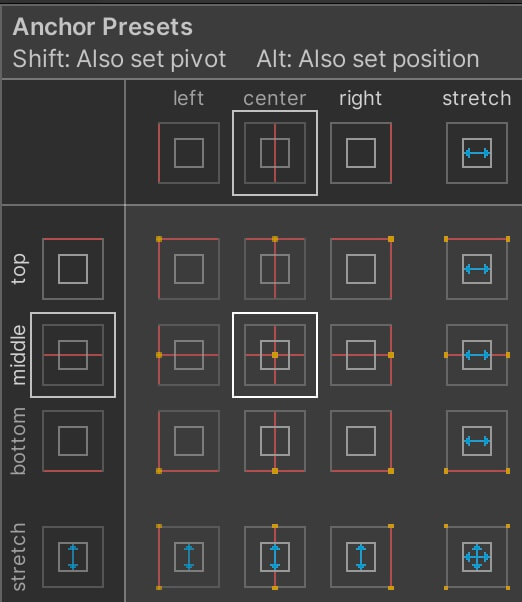
So in our case for the Image, we are going to set it at the bottom left:
Creating The Main Menu UI
Next, select the Image and rename it to BG and for the Anchor or the BG image select the stretch anchor at the bottom right corner:
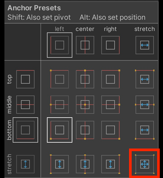
The stretch anchor will make the UI element stretch itself to match the specified part of the screen, in this case, it will stretch to match the full size of the screen.
But for that we need to change the values in the Rect Transform component:
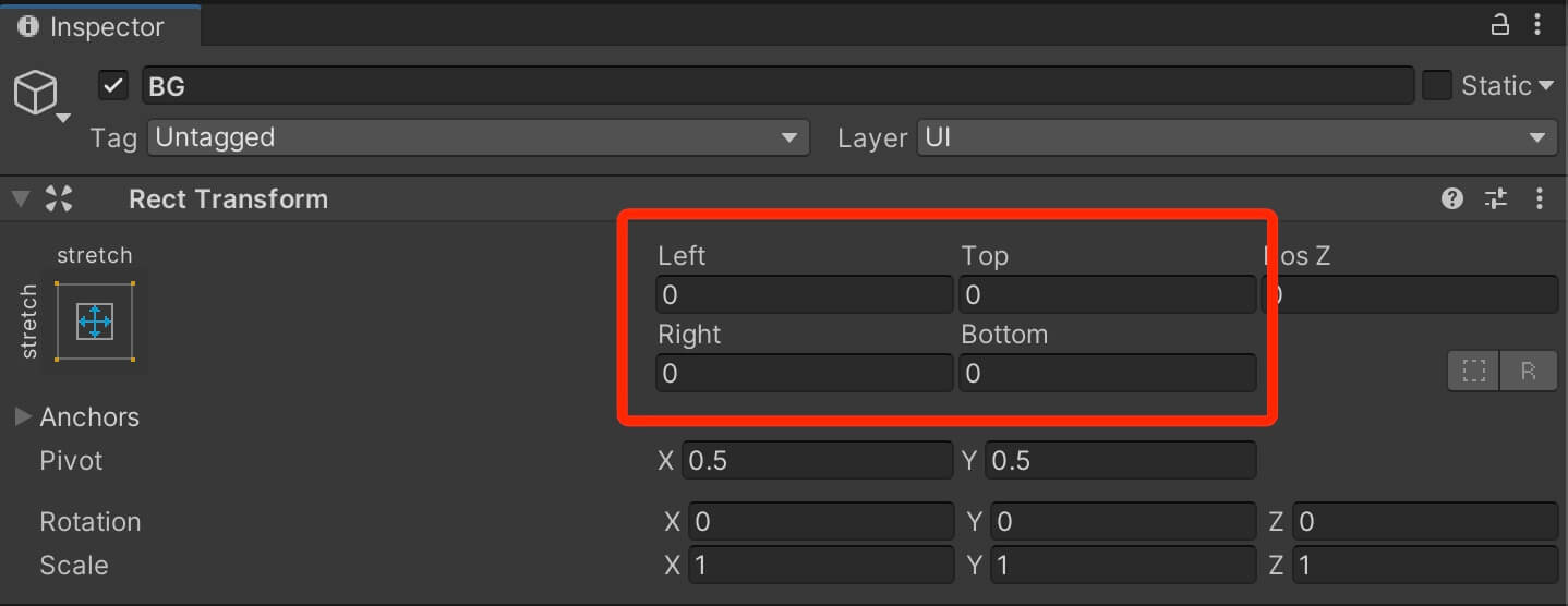
When we set the values for Left, Right, Top and Bottom to 0, the UI element will stretch and take up the whole screen.
At the moment, we only see white because that is the default color of the UI Image.
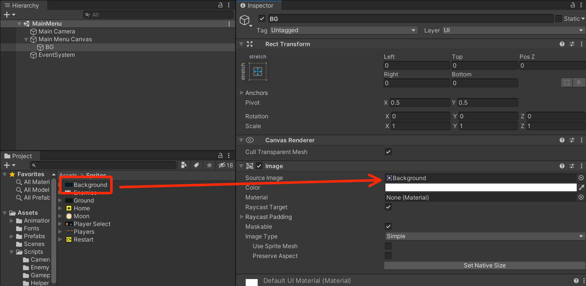
Select the BG Image in the Hierarchy, and from the Assets -> Sprites folder, drag the Background sprite in the Source Image empty field of the Image component for the BG UI element:
Changing The Size Of UI Elements
Moving forward, select the Main Menu Canvas in the Hierarchy, Right Click -> UI -> Image to create a new image.
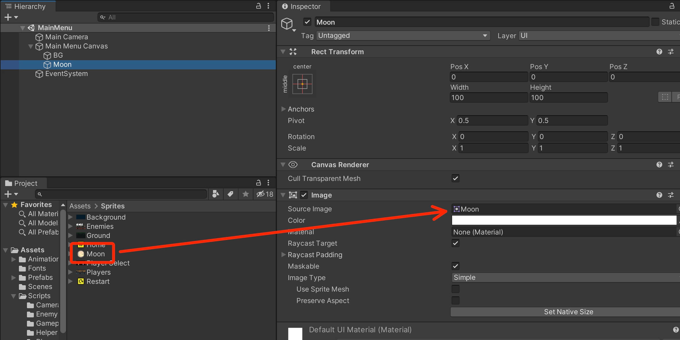
One thing that you will notice is that the Moon image is small and it looks distorted. This is because the default width and height of the UI Image is 100 by default:
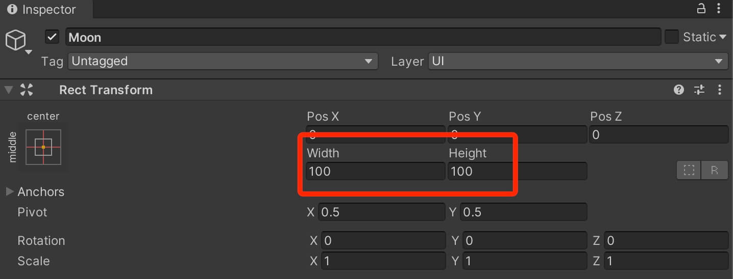
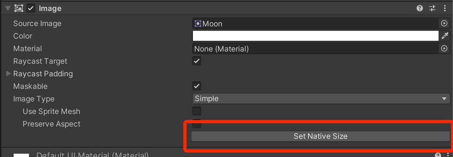
This will automatically change the Width and Height values in the Rect Transform to the native size of the sprite image e.g. the size of the actual image file.
You can always resize the image and any other UI element using the values in the Rect Transform, and you can also resize UI elements with the help of the Rect Tool:
Next, change the anchor for the Moon object to top left corner:
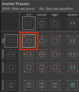
And now we can position the Moon object somewhere in the top left of the screen, but before we do that, one thing that I want to mention is that the UI elements also game objects, which means we can move them in the Scene tab the same way we move other game objects:
UI Text
Next, select the Main Menu Canvas and Right Click -> UI -> Text. Name the text object Game Logo, and set its anchor to top middle:
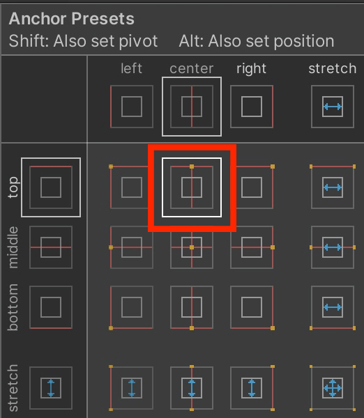
Set the following values for the position and the size of the text UI:
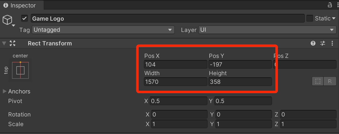
When it comes to the text UI the are all sorts of things that we can change. We can use custom fonts, we can change the font size, we can set the text alignment, we can change the text color and so on.
All these options are located under the Text component that is attached on the text UI object:
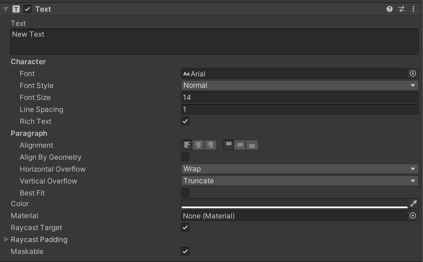
The field options are self explanatory, in the Text field you can type the text that will presented by the text UI.
Under Font you can set your custom font, under Font Style you can set the text to be normal, bold, italic etc. The Font Size option will resize the text and so on.
Under Paragraph you have the alignment, and below it you have the color that you can use to set any color you want for your text. You can play around with the settings and see the outcome on the text UI object.
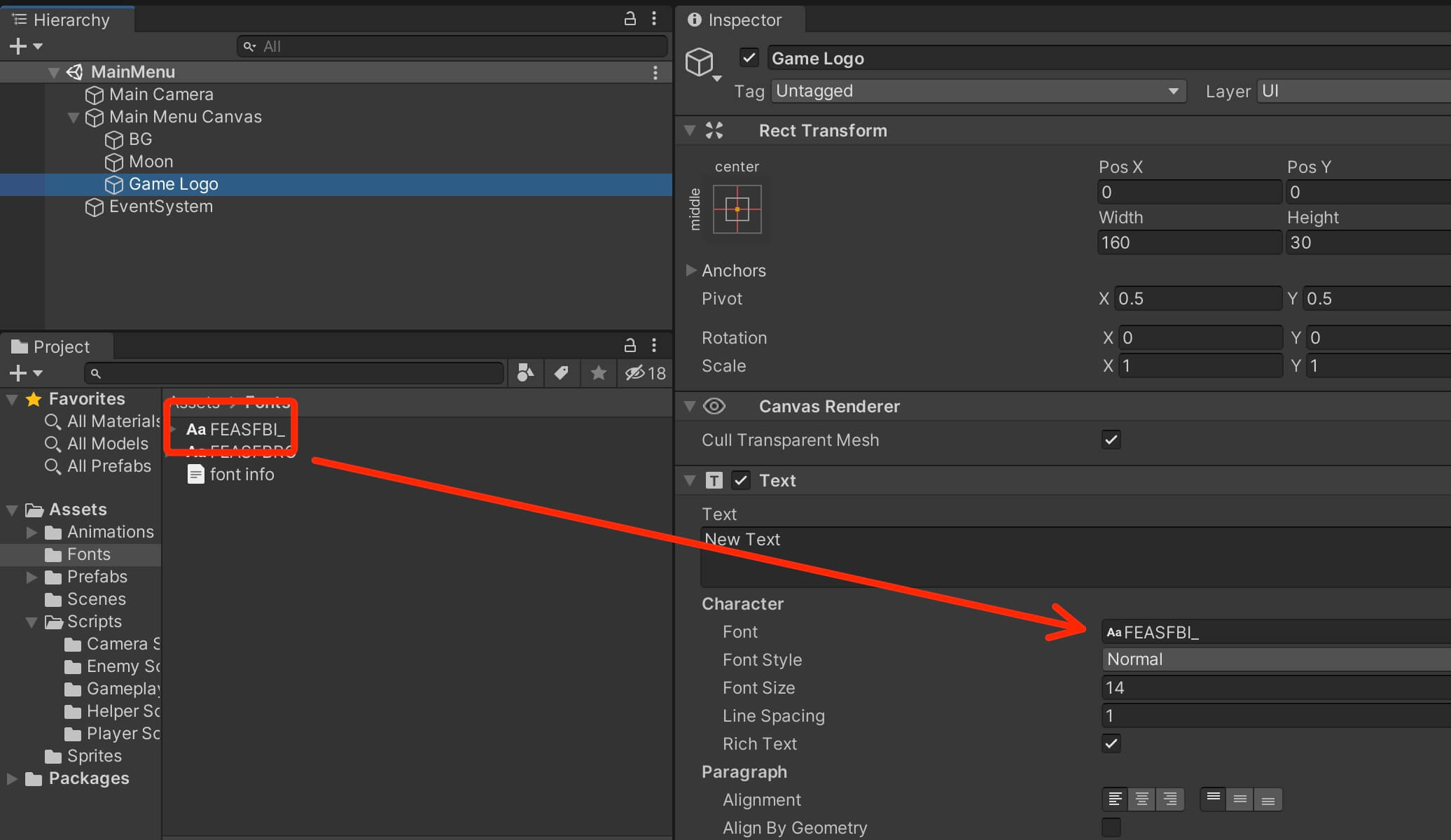
To use a custom font, just place the font that you imported in the Font field. From Assets -> Fonts folder drag the FEASFBI_ font in the field of the Game Logo:
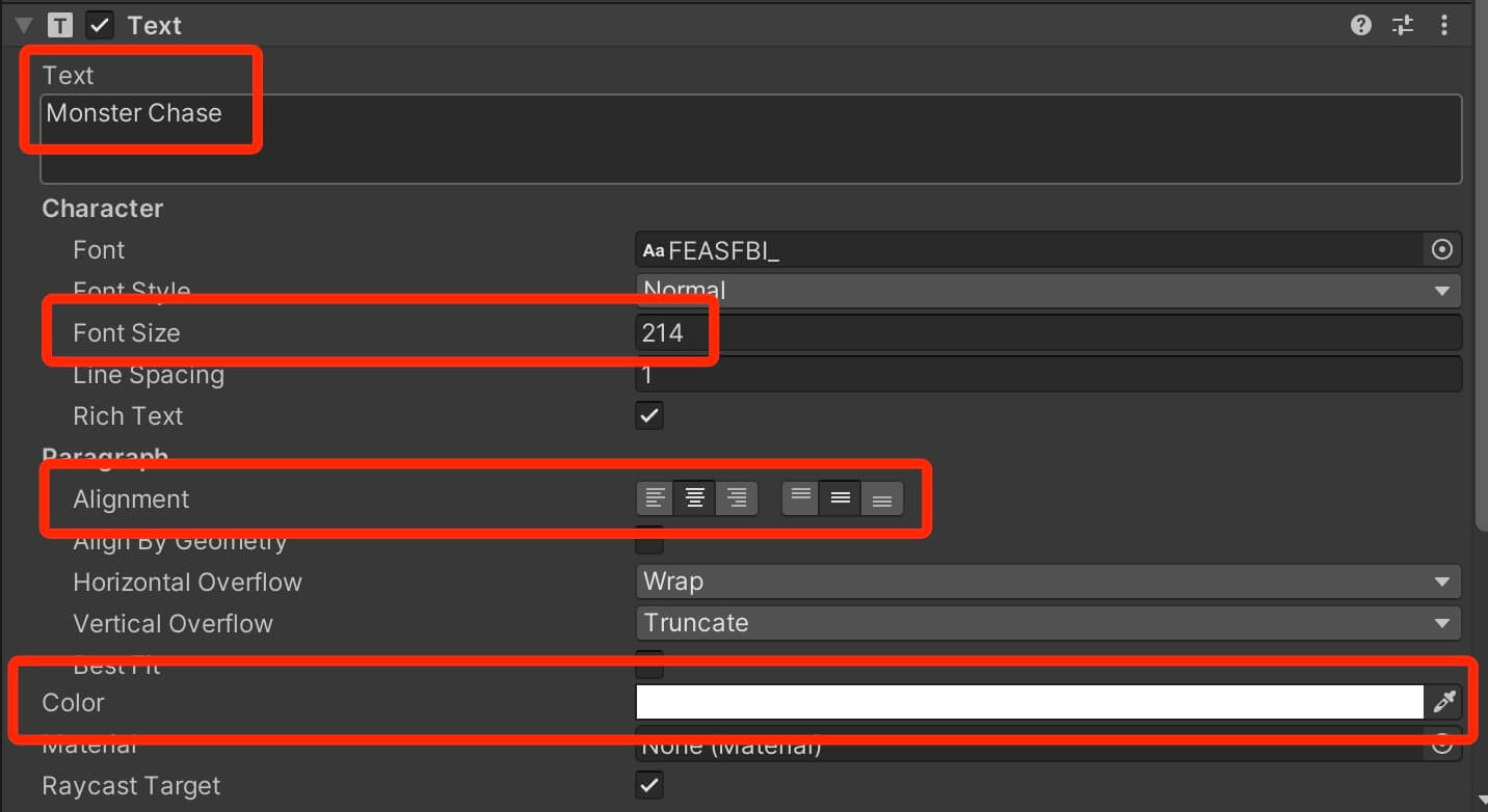
For the text we are going to write Monster Chase, Font Size is going to be 214, Alignment middle center and the color of the text is going to be white:
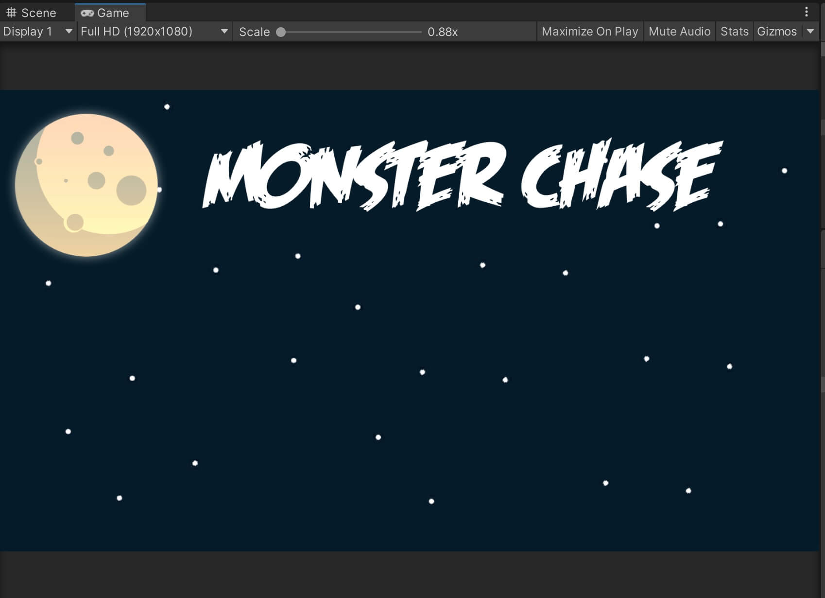
When we are done, this is how our text UI looks like:
UI Button
To be able to select a specific player with which we want to play the game with, we need buttons.
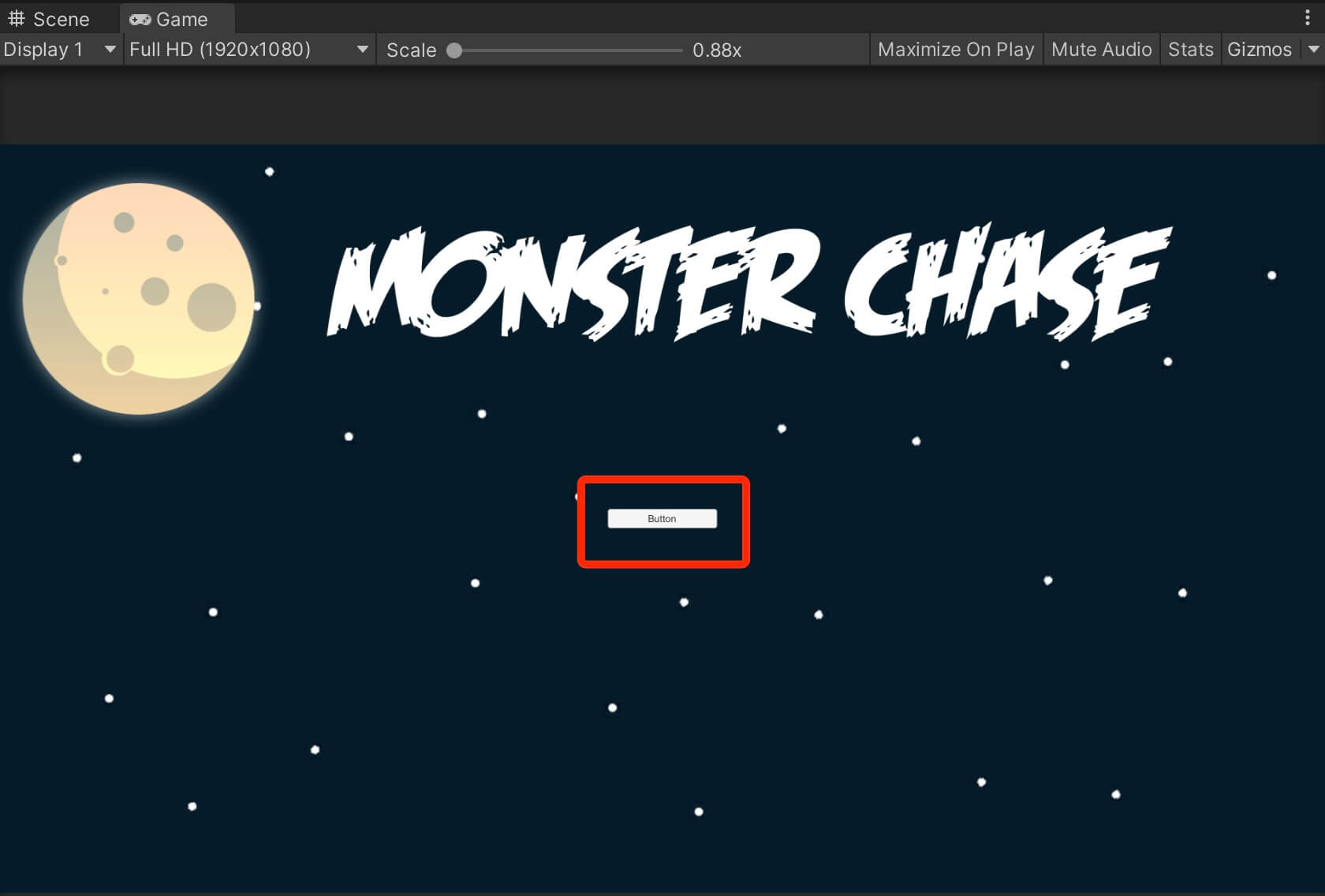
Select the Main Menu Canvas, Right Click -> UI -> Button. This is going to create a default button and place it in the game:
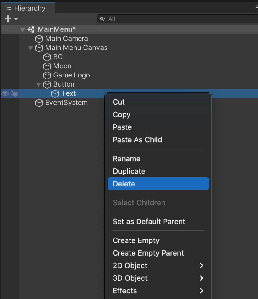
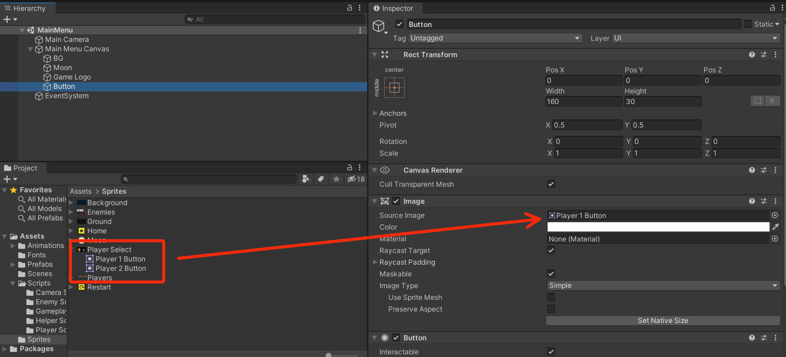
The same way how you can resize a UI image, you can resize the button by pressing the Set Native Size in the Image component on the button object.
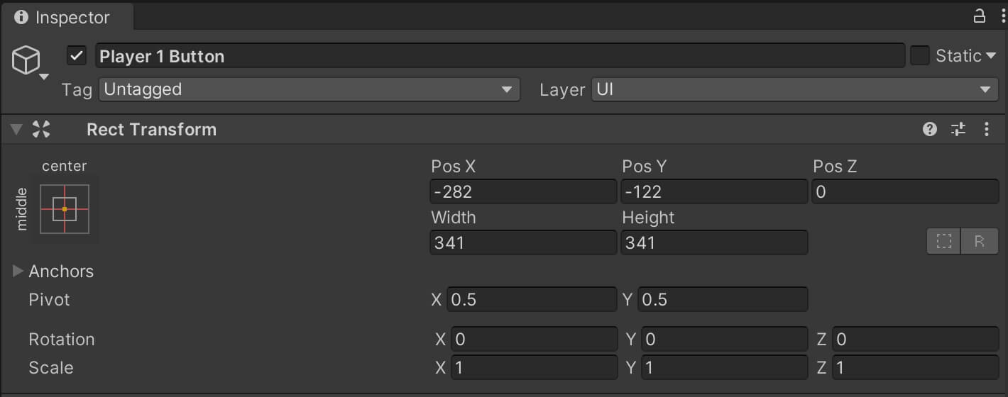
Rename the button to Player 1 Button, we will leave the anchor at its default which is middle center, and set the following values for the position of Player 1 Button:
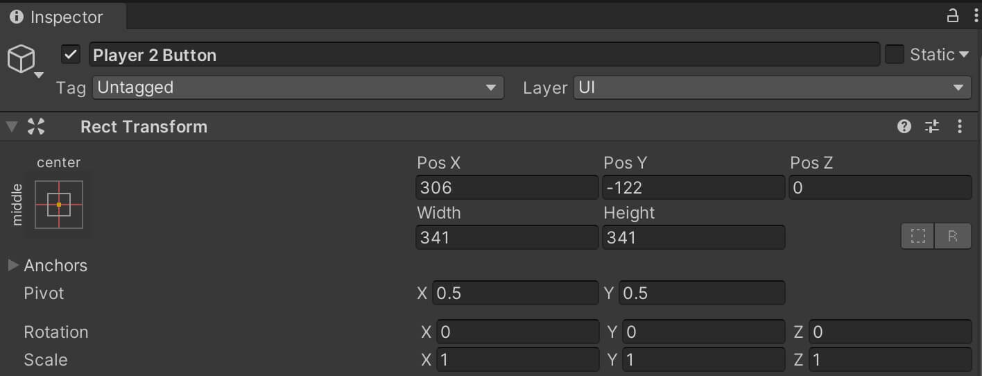
Now we can simply duplicate Player 1 Button, rename it to Player 2 Button, attach the Player 2 Button sprite to the Image component of Player 2 Button object, and set the position of Player 2 Button to the following values:
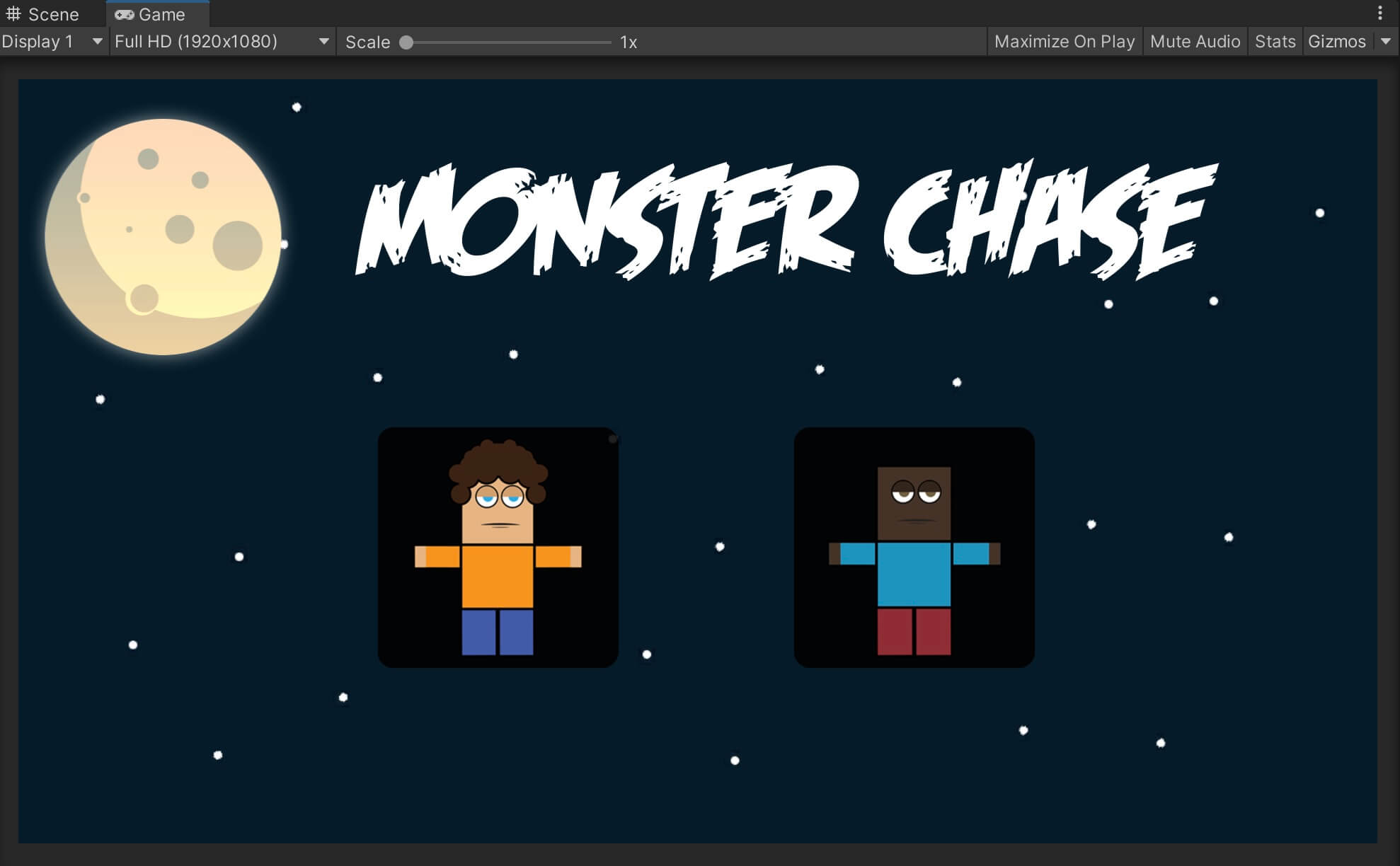
You can always reposition the UI elements or add your own UI elements to make the main menu look better, that is up to you.

Comments are closed.