In part 6 of this tutorial series we learned some new tricks that we can do with Geometry Actors and we also prepared our level goal.
In this part of the tutorial we are going to create the game over UI.
What Is An User Interface - UI
Creating A UI Blueprint

When you create it, give it a name BP_GameOver_UI.
If this was a bigger game with more UI Blueprints I would have created folders where I would store UI Blueprints, but since this is a small game and this is the only UI Blueprint that we will have there is no need for that.
Open the BP_GameOver_UI in the Blueprint editor. You will notice that the editor for the UI Blueprints is a little different than the editor for normal Blueprints:
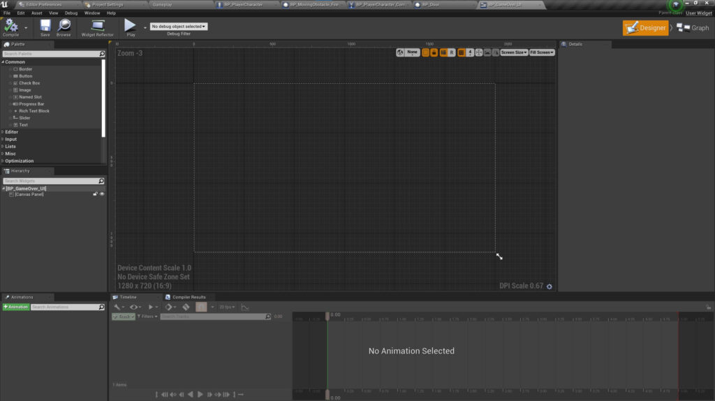
Exploring The UI Blueprint Editor
Looking at the image above, in the middle we have the Editor tab where we will place and see all the UI widgets we want to use for this Blueprint.
On the left side we have the Palette tab which contains all the UI widgets that you can use and place inside the canvas.
Next, we have the Hierarchy tab which shows all the UI widgets currently used.
Below the Hierarchy tab we have the Animations tab which is used to create animations with UI widgets.
On the right side of the Animations tab we have the Timeline tab which contains tracks for the animations that we create.
The Compiler Results tab will show us any errors or warnings when we compile the UI Blueprint.
And on the left side we have the Details tab which shows the details of the selected UI widget.
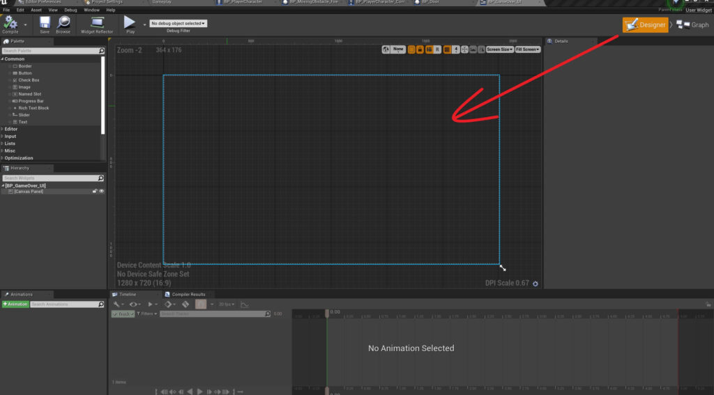
At the top right corner, above the Details tab you will notice two buttons, Designer and Graph:

The Designer button opens the UI Blueprint Design Mode where we can add UI widgets to create our desired UI interface:
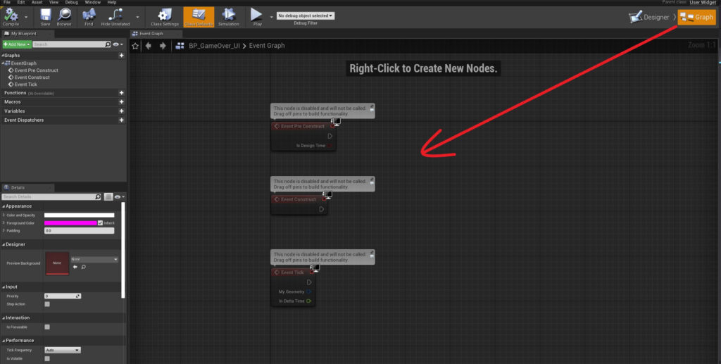
The Graph button opens the Graph editing mode where we can code using nodes same as in normal Blueprints:
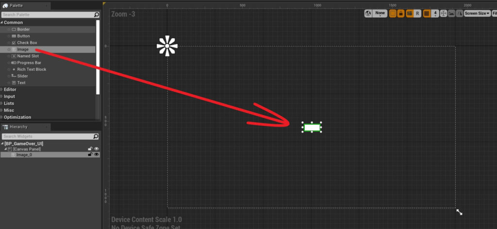
Adding UI Widgets In The Canvas
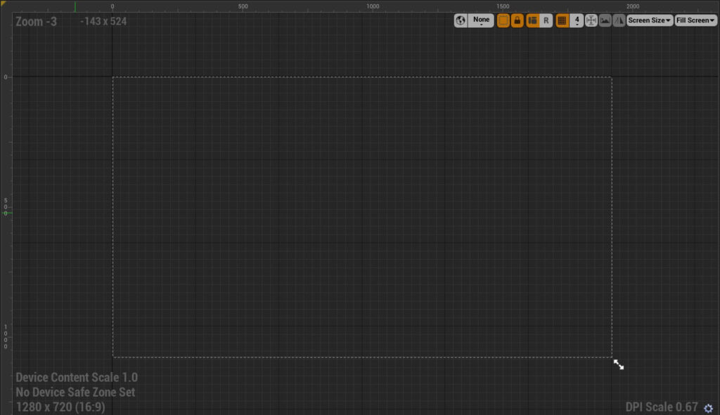
The white dotted lines forming a rectangle inside the Editor window is called a canvas:
When it comes to Compile and Save, the same rules that apply to normal Blueprints also apply to UI Blueprints which means after any change we make press the Compile and Save button.
Now that we have a UI widget in the canvas, you can see that widget in the Hierarchy tab:

UI Element Settings
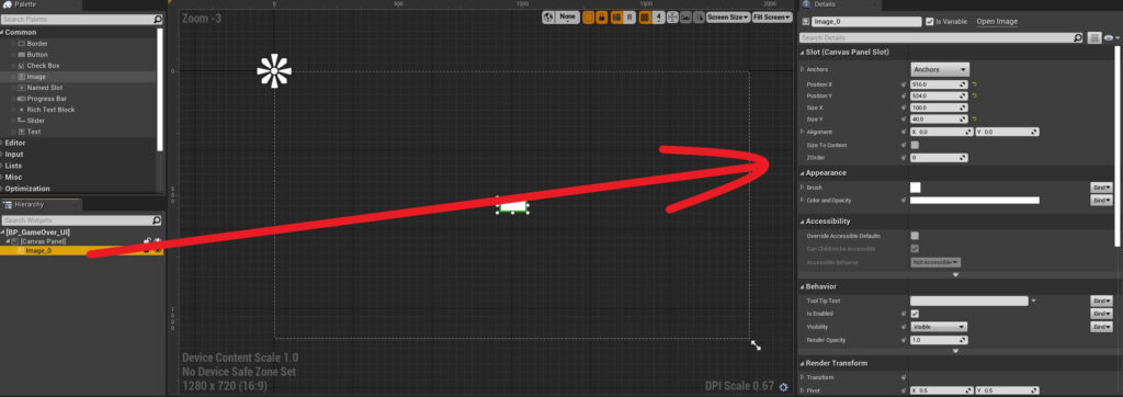
In the Details tab you will find different settings for the UI widget such as its position, size, alignment and so on.
Now when it comes to the UI image we added, change its name to BG inside the Hierarchy tab.
Next, inside the Details tab under the Slot (Canvas Panel Slot) settings for the Anchor property click on the drop down list:


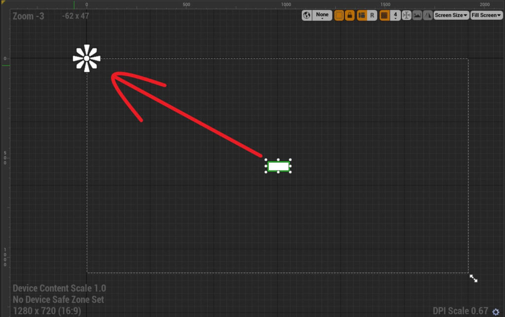
I am going to change the anchor for the BG image to the stretch anchor which is the one at the bottom right corner inside the anchor presets:

Now we can change the values for Offset Left, Top, Right and Bottom inside the Details tab under the Slot (Canvas Panel Slot) setting for the BG image:

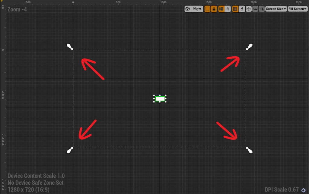
When you do that you will notice that the BG image has stretched to fill the whole canvas:
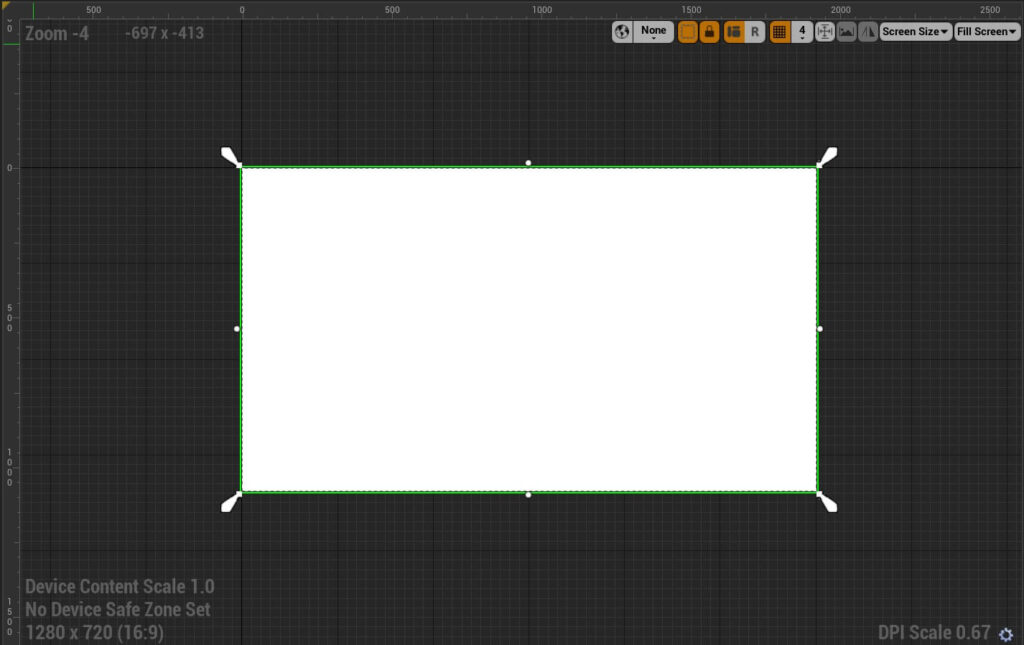
This is because of the stretch anchor which is placed on the whole canvas as we saw from the arrow like icons located in every corner of the canvas.
Next inside the Appearance settings for the Color and Opacity property click on the color palette:

When you do that a Color Picker pop up window will appear where we can select a new color for the BG image.
However, we are not going to change the color for the BG image, instead we are going to set a new value for the alpha channel for RGBA colors of the BG image.
Currently, the value for alpha channel is 1.0, we are going to set it at 0.3:
This will change the opacity of the image making it transparent.
Adding A Text And A Button Widget
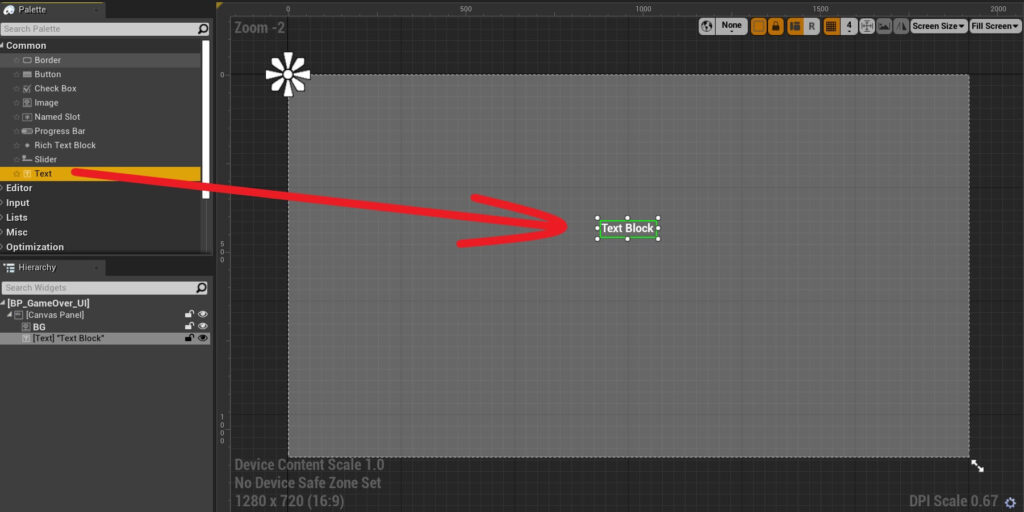
Next we are going to add a text widget in the canvas. From the Palette tab, drag the text widget in the editor:
Inside the Slot(Canvas Panel Slot) settings choose the middle or center anchor for the text widget:

For the position set the following values:
- X = -465
- Y = -265
And for the sizes set the values:
- X = 918
- Y = 341

After you type Game Over! you can hold shift and press enter to go on the line below and then type Play Again?
This way the text will appear one below the other.
Under the Appearance settings which is right below the Content, for the Justification which is basically alignment, set the alignment to middle:

Inside the Appearance settings again, click on the drop down list for the Font property and set the font size value to 108:

The rest of the settings I am going to leave as is, but you can explore and change the values on your own to see the effect that you will achieve, and this is the best way to retain the knowledge that you are learning.
Next, we are going to add a button widget to the canvas. From the Palette tab drag a button inside the canvas:
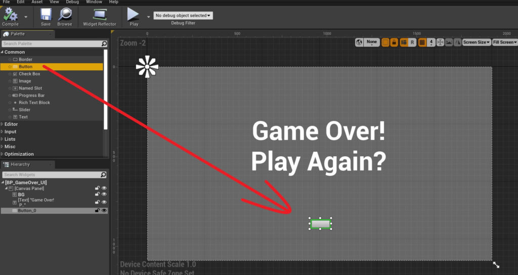
Inside the Hierarchy tab rename the button widget to Play Game Button.
In the Details tab inside the Slot (Canvas Panel Slot) settings set the anchor for the button widget to center, and set the following values for the position:
- X = -188
- Y = 223
For the size set these values:
- X = 365
- T = 100
As you can see UI widgets can be children of other UI widgets.
For the text widget that is the child of the Play Again Button widget, set the text to Play Again inside the Content settings, and set the font size to 44:

We are also going to change the color of the text by clicking on the color palette under the Color and Opacity property in the Appearance settings:

When the Color Picker window appears select the dark color for the text and press OK:

Spawning The UI Blueprint In The Game

Inside the Create Widget node, under the Class, click on the drop down list and filter for the UI Blueprint you wish to create, in our case BP_GameOver_UI:


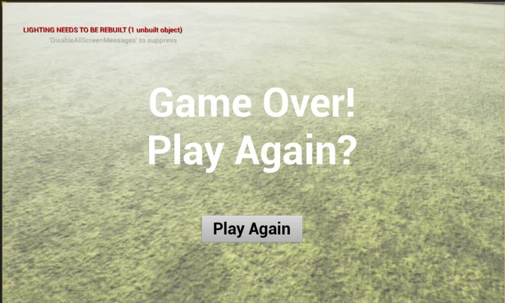
Of course, we are not going to leave the UI like this, but I just wanted to demonstrate how we add UI widgets inside the game e.g. how do we make them visible in the game after we created them.
You can delete the nodes that create the game over UI so that it’s not spawned when the game runs.
Later we will create a function that will do that for us when the game is actually over by reaching the goal or if the PlayerCharacter gets caught by the monster.
Comments are closed.